For this edition of WHAT/IF, I took on the challenge of redesigning the logos of the eight national teams that reached the EURO 2020 quarterfinals. This was a spontaneous, experimental project that took about six hours, from initial sketches to final execution.

Approach
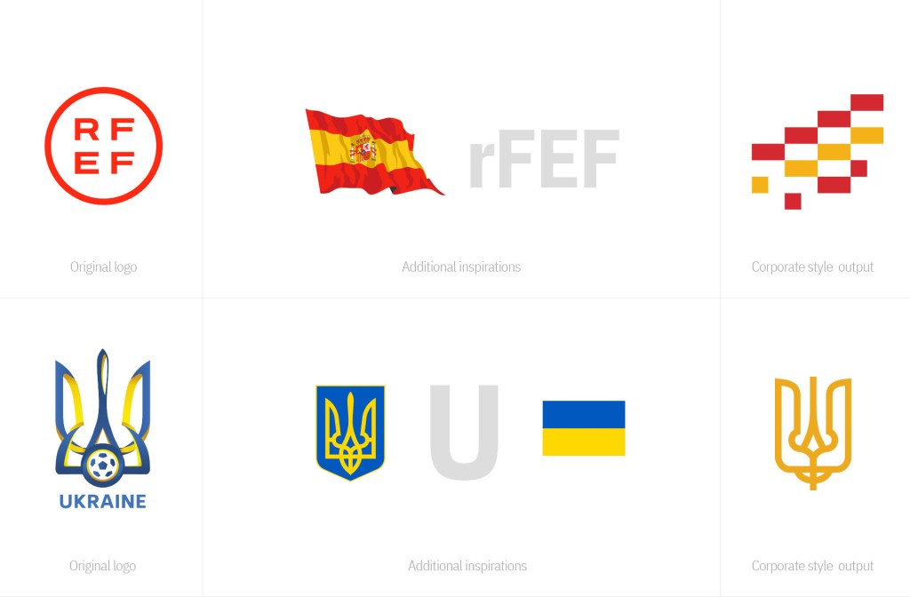
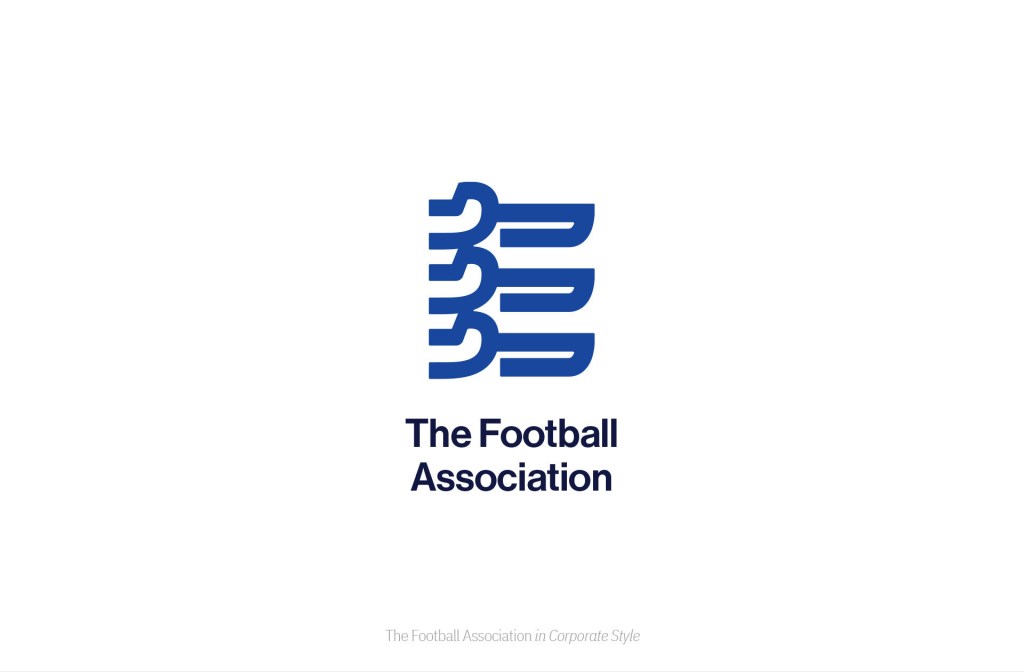
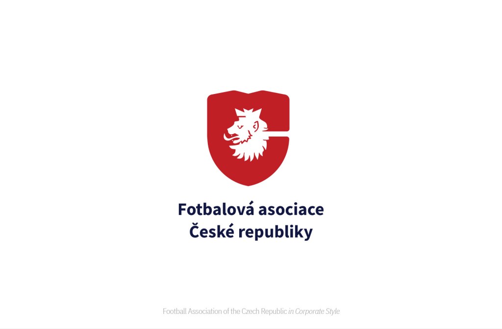
My goal was to explore how these national football identities could be interpreted in a corporate branding style while keeping their essence intact. The strategy behind each redesign involved:
- Merging elements from the national flags and existing logos to create a sense of familiarity.
- Incorporating the first letter of each country’s name to enhance recognizability.
- Keeping the style modern, bold, and versatile, as if these were corporate brands rather than traditional football emblems.


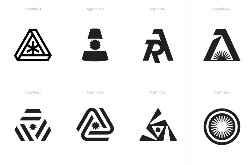
BONUS: Argentina – Copa América 2021 Champions
Alongside the EURO 2020 series, I also experimented with a corporate-style redesign of Argentina’s Football Association logo, celebrating their Copa América 2021 victory.


This project was a fun design exercise, blending sports identity and corporate aesthetics. It was an exciting way to push logo design boundaries while maintaining the core symbolism of each nation.


