
Logo is more than just a pretty design—it’s the face of the brand. It’s what people recognize, remember, and connect with. For your own business, with so many different types of logos, how do you know which one fits your brand best?
Let’s break it down, one by one.
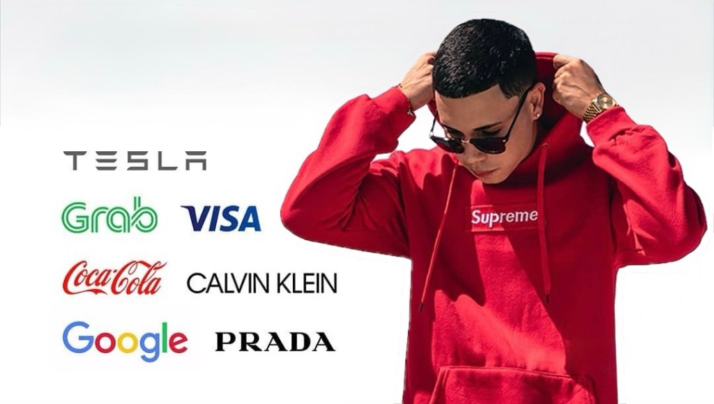
Wordmarks (Logotypes)
If your brand name is unique and easy to remember, a wordmark might be the way to go.
- Think Google, Coca-Cola, or Disney—logos that are all about the font.
- Works best for businesses with short, distinct names.
- Typography is everything. The right font can make or break a wordmark.
- Most popular in fashion—Gucci, Chanel, and Louis Vuitton all use them.
If you go for a wordmark, don’t just pick a random font. You need something that feels custom, polished, and reflective of your brand.
Lettermarks (Monograms)
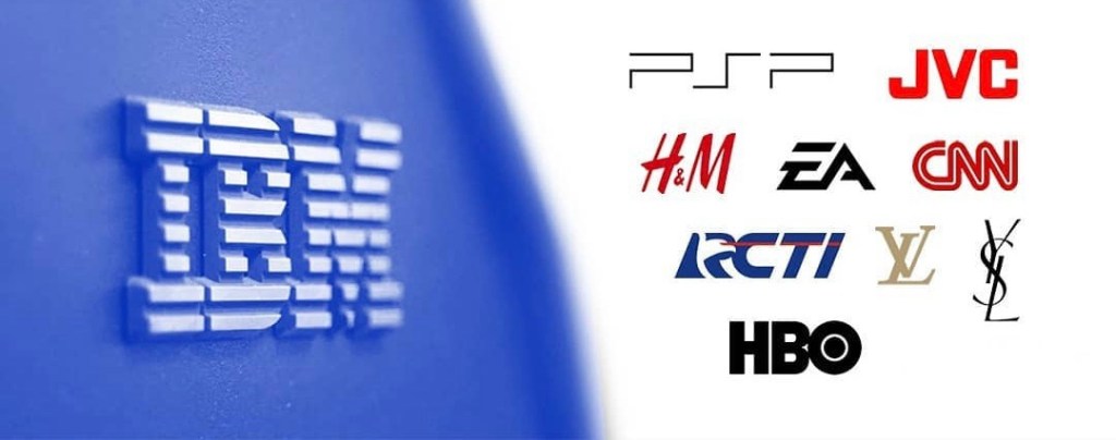
When your brand name is long, a lettermark helps keep things simple.
- Uses initials instead of the full name—think HBO, CNN, or NASA.
- A clean, professional look that works great for corporate and tech brands.
- Short and easy to recognize, especially in digital spaces.
If your company has a long or complicated name, a lettermark can save you from an overcrowded logo.
Letterforms (Letter Logos)
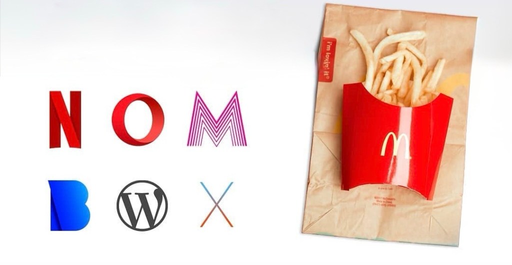
Letterforms take minimalism to the next level.
- Uses just one letter—like McDonald’s “M” or Netflix’s “N.”
- Simple, bold, and instantly recognizable.
- Works best when the letter design is unique and memorable.
The trick here is to create something iconic with just one letter. That’s why strong typography is non-negotiable.
Pictorial Marks (Logo Symbols)
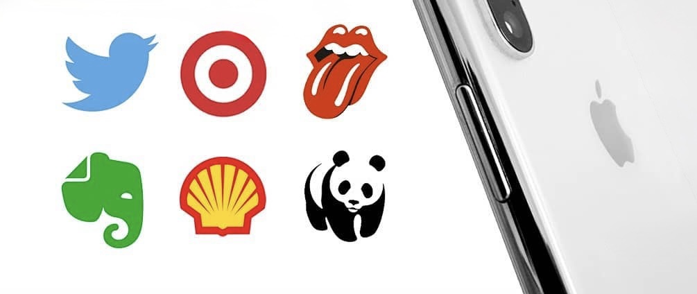
A picture is worth a thousand words—especially when it’s your logo.
- Uses a single, recognizable icon—like Apple’s apple or Twitter’s bird.
- Best for brands that are already well-known.
- Can symbolize your brand’s values or industry.
Pictorial marks are powerful, but they take time to build recognition. If you’re just starting, pairing it with a wordmark (at least at first) might be a smart move.
Abstract Marks
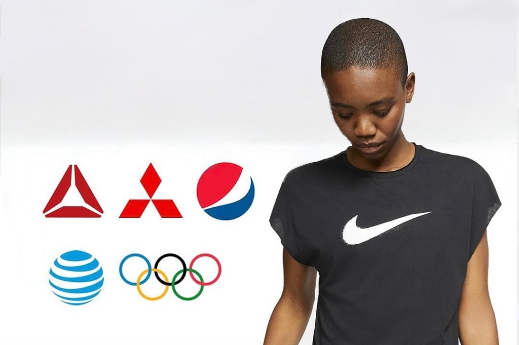
Abstract logos are all about creativity and uniqueness.
- Uses geometric or artistic shapes instead of a literal image.
- Think of Nike’s swoosh or Adidas’ three stripes—simple but iconic.
- Doesn’t tie your brand to a specific object, giving more flexibility.
The key here? Keep it simple. A good abstract logo should be memorable, not confusing.
Mascot Logos
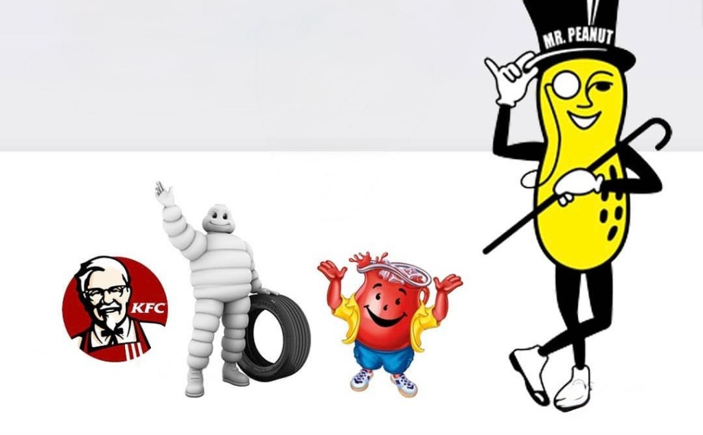
Mascots add personality to a brand like nothing else.
- Features an illustrated character—like KFC’s Colonel Sanders or the Pringles guy.
- Works great for family-friendly, playful, or food brands.
- Grabs attention and makes your brand feel more relatable.
The downside? Mascots don’t always work for every platform, especially in small-scale branding like app icons or business cards.
Combination Marks
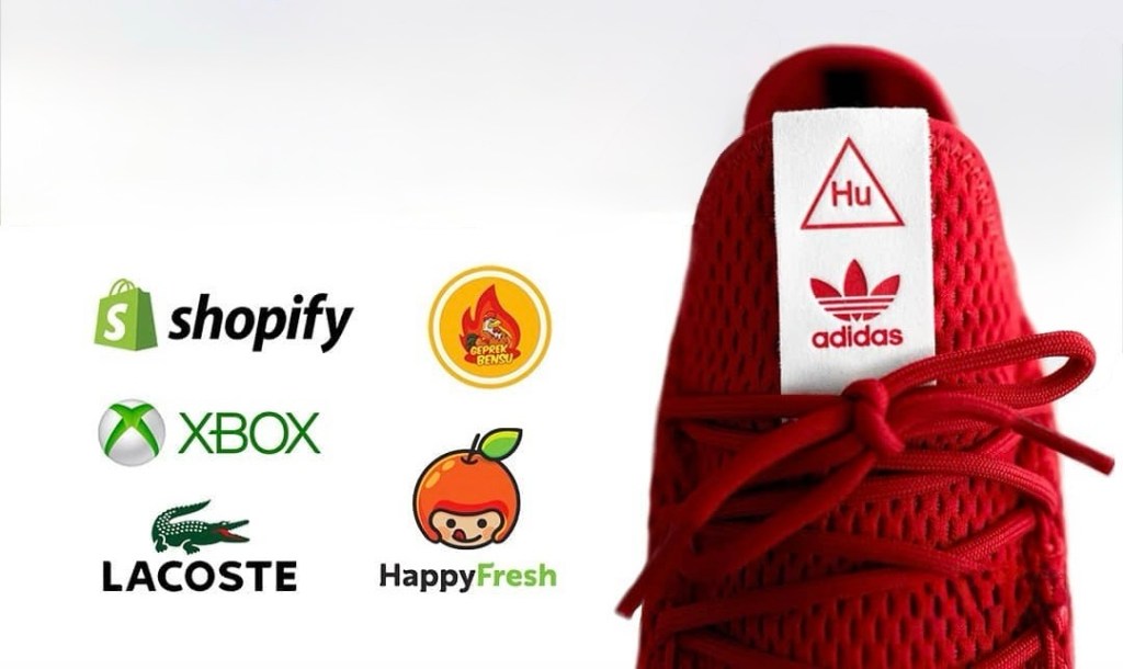
Can’t decide between a symbol and text? Go for both. This usually happens when you want to use a symbol as a logo, but there’s a concern that it might not be easily recognizable.
- Pairs a wordmark or lettermark with a symbol—like Shopify, Lacoste, or HappyFresh.
- Offers flexibility: You can use the full logo or just the symbol when needed.
- Ideal for new businesses that want strong brand recognition.
Combination marks are one of the most common logo styles—and for good reason. They’re versatile, clear, and easy to use across different branding materials.
Emblem Logos
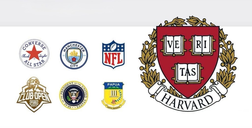
If you want a logo with a classic, official feel, an emblem might be your best bet.
- Features text inside a symbol or badge—think Starbucks, Manchester City, Inter Miami, or Harley-Davidson.
- Feels timeless and prestigious, often used by universities or government organizations.
- Has a lot of detail, which can make it harder to scale down for small designs.
Emblems work great for brands that want a traditional and sophisticated look. Just make sure it’s not too complex for digital use.
So, Which Logo Type Is Best for You?
Now that you know the 8 types of logos, how do you choose the right one? Here’s what to consider:
- Your Brand Name: If it’s unique and short, a wordmark works. If it’s long, consider a lettermark.
- Your Industry: Abstract and pictorial marks are great for tech and lifestyle brands, while emblems work well for institutions.
- Your Audience: Mascots are fun and friendly, while letterforms feel sleek and modern.
- Your Growth Plans: If you plan to expand globally, an abstract or pictorial mark might be a smart move since it’s not tied to a specific language.
Your logo is one of the most important elements of your brand identity. Take your time, experiment, and find a style that truly represents what you stand for.
